"""
author:少校
create Time:2025/2/27 14:14
越努力越幸运
"""
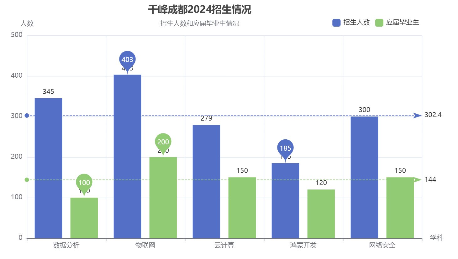
#导入图标类
from pyecharts.charts import Bar
#导入图标配置类
from pyecharts import options
#1.创建柱状图对象
bar = Bar()
#2.添加数据
bar.add_xaxis(["数据分析","物联网","云计算","鸿蒙开发","网络安全"])
bar.add_yaxis("招生人数",[345,403,279,185,300])#,color="red",bar_width="50")
bar.add_yaxis("应届毕业生",[100,200,150,120,150])#,color="#d3d3d3",bar_width="50")
#3.添加配置
#1)全局配置
bar.set_global_opts(
#设置标题
title_opts=options.TitleOpts(
title="千峰成都2024招生情况", #主标题
title_link="https://0246.net", #主标题URL
subtitle="招生人数和应届毕业生情况", #副标题
subtitle_link="https://0246.net", #副标题URL
text_align="center", #主标题和副标题的对齐方式:left,right,center
pos_left="400", #设置标题位置:pos_left,post_right,pos_top,pos_bottom
),
#设置图例
legend_opts=options.LegendOpts(
is_show=True, #是否显示
pos_right=90, #设置图例位置
pos_top=25,
item_width=15, #设置图标宽度
),
#设置X轴
xaxis_opts=options.AxisOpts(
name="学科"
),
#设置Y轴
yaxis_opts=options.AxisOpts(
name="人数"
),
)
#2)系列设置
bar.set_series_opts(
#设置标签
label_opts=options.LabelOpts(
is_show=True,
position="top", #top/left/right/bottom
#color="" #设置颜色、英文单词、16进制颜色、rgb都可以
),
#标记点(最大值、最小值)
markpoint_opts=options.MarkPointOpts(
data=[
#type:#max#min
options.MarkPointItem("最大值","max"),
options.MarkPointItem("最小值","min")
]
),
#平均值标记线
markline_opts=options.MarkLineOpts(
data=[
#type max min average(平均值)
options.MarkLineItem("平均值","average")
]
)
)
#3) 数据配置
#4.制图
bar.render("charts/01柱状图.html")